Your Card is Defrosting
Avant needed a product image that could carry the whole idea at a glance. No setup. No long explanation. Just a card, frozen in ice, starting to thaw. The metaphor did the work immediately. Frozen means stuck. Thawing means movement. Access. Momentum returning. The job was to make that idea feel physical, premium and believable enough that you could almost feel the cold coming off the image.
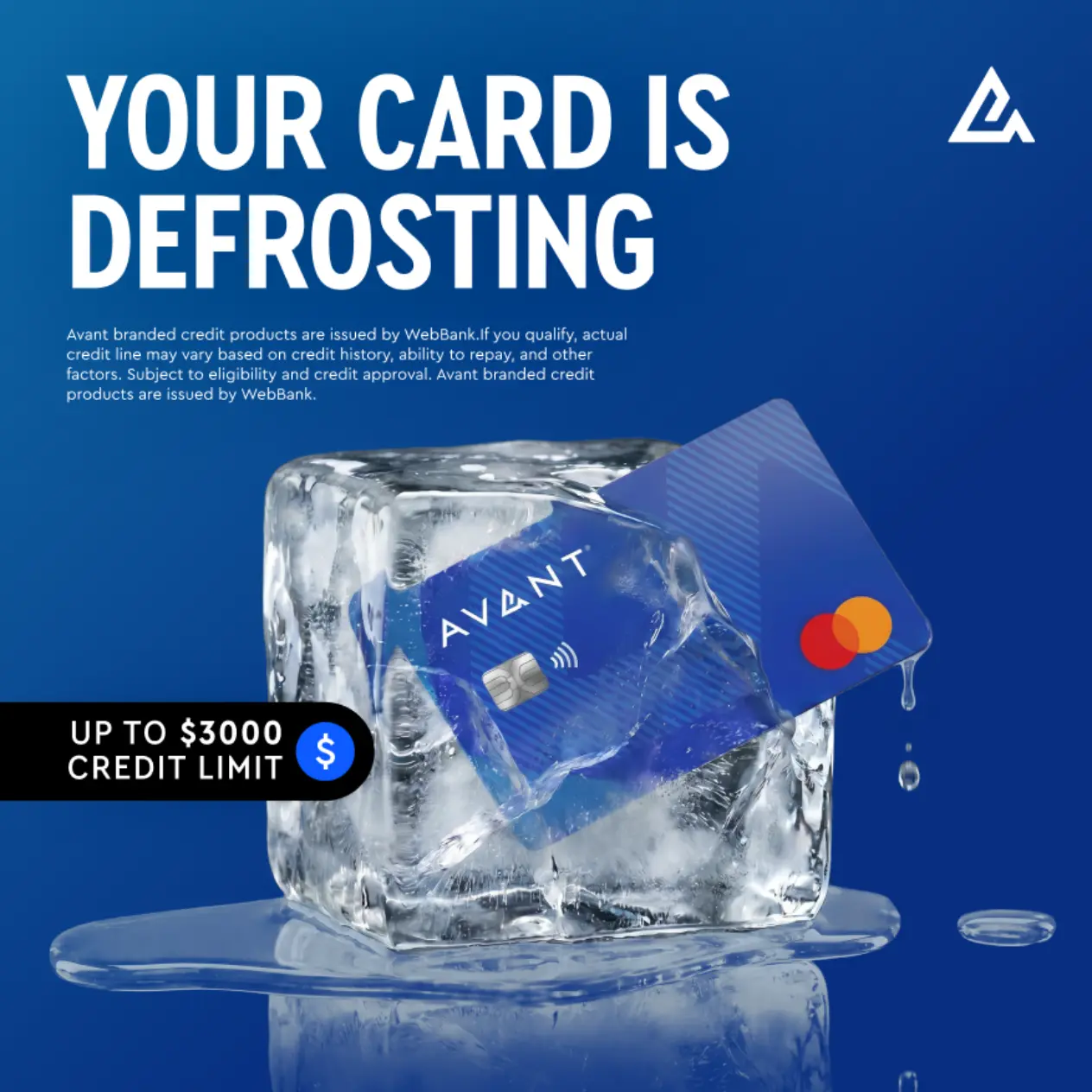
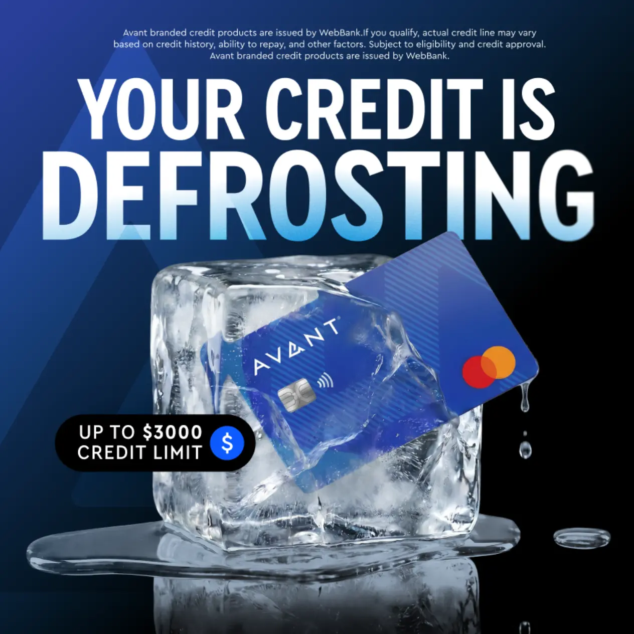
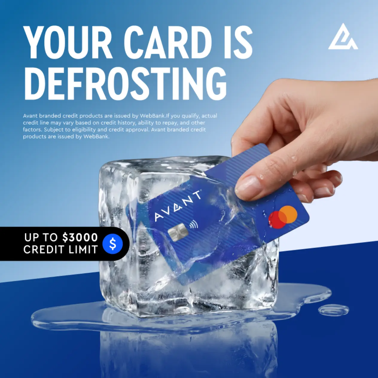
The concept worked because it took a financial feeling and made it visual. Everyone understands what it means to be frozen. Everyone understands the relief of something starting to loosen.
That gave us a strong creative lane: make the card feel trapped, then make the release feel inevitable. Not dramatic for the sake of it. Just a clear, tactile moment that said things are moving again.
The Process
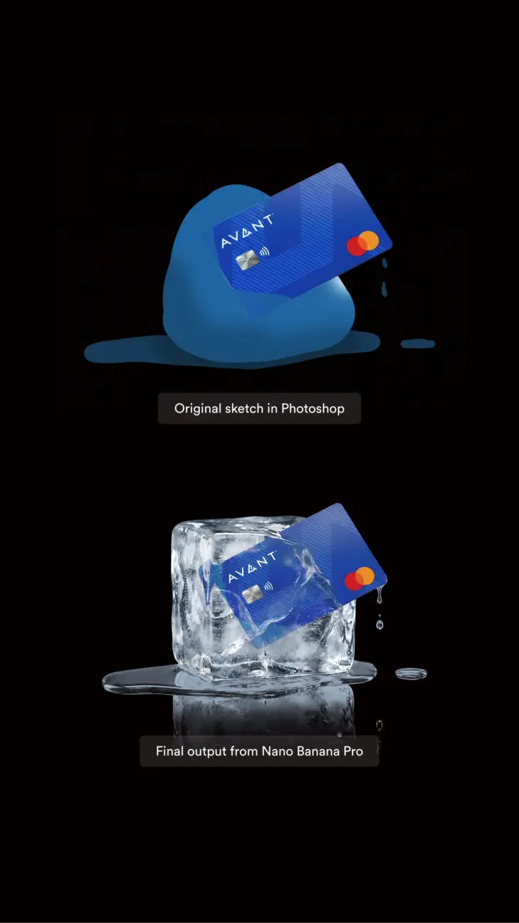
The final image started with a rough Photoshop sketch. Before generating anything polished, we placed the Avant card into a crude blue ice shape to give the AI a clear reference for scale, angle and composition. From there, each pass fixed the next problem: material, physics, brand accuracy, hand placement and format.
- The Photoshop sketch. We built a rough comp first: card placement, ice shape, angle and scale. It was not meant to look finished. It was there to stop the AI guessing.
- The ice and the melt. With the structure locked, we refined the ice until it felt physical. The melt needed one clear source, believable droplets and a pool that actually belonged to the cube.
- The cube. Early versions felt too uneven. We pushed for a truer block of ice: square footprint, level top, softened edges and enough distortion to keep it natural.
- The card. The card had to stay sharp while sitting inside ice. We protected the logo, chip, Mastercard mark and pattern, then let the refraction do just enough work.
The Result
One hero image carried the campaign across square and vertical social formats.
The final work looks simple, but that simplicity came from a technical process: a Photoshop placement sketch, controlled AI image generation, brand reference locking, physics-led refinement and repeated art direction passes. Each stage gave the image more structure. The AI was not left to invent the idea. It was guided, corrected and pushed until the metaphor felt real.
That is where the work became valuable. Not because AI made an image quickly, but because the right references, prompts and creative judgement turned a rough concept into a polished campaign asset.
A simple metaphor, built with precision.