Developing Finom's 3D Language
A look inside how we developed Finom's 3D asset library, turning abstract fintech concepts into physical, rendered objects with a visual language that's bold, cohesive, and impossible to ignore.
Building out Finom's asset library was largely a materials problem. The brand has a strong colour world, pinks and violets with a lot of depth to them, and the challenge was figuring out how to translate that into objects that actually felt physical. We landed on glass and soft metallics as the primary surfaces. They respond well to light, carry colour, and there's something about translucency that suits fintech. Precise, but not sterile.
A lot of the work was in the lighting. Getting refraction to behave through glassy geometry takes time, and we went back and forth on it more than anything else. The difference between something that looks rendered and something that feels real is usually in the lighting
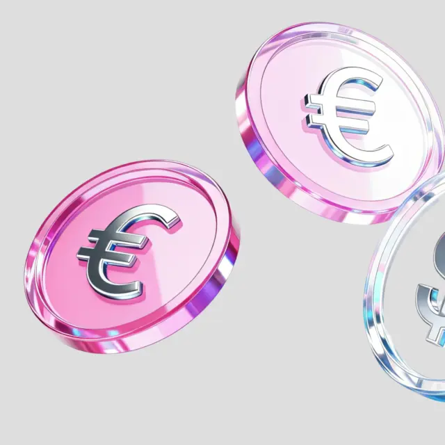
Reflective Coins
The coin renders were about finding the right balance between brand colour and material honesty. Pink glass, chrome lettering, the coins needed to feel like Finom's but still read as currency. We pushed the translucency until the forms felt light without losing their weight.
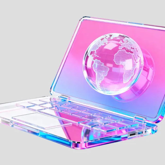
Global Reach
The laptop was one of the more technically interesting objects to work through. Getting the gradient to sit inside the form correctly, pink into blue across the chassis, took a few passes. The glass keyboard has a lot of geometry and light hitting it from multiple angles, so keeping it legible without losing the material quality was the main challenge.
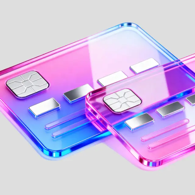
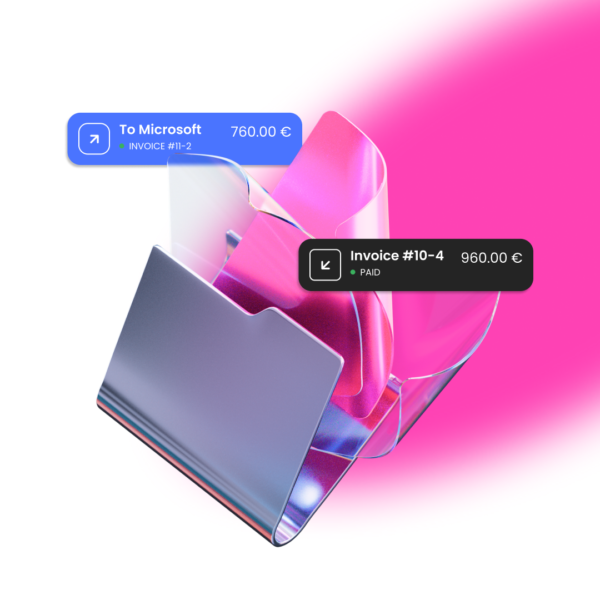
The Card
Two cards, same material language, slightly different colour reads depending on the angle. The chrome chip detail was important to get right, it needed to feel like a real card object, not just a shape. The overlap in the composition came from wanting to show the system rather than a single asset in isolation.