Go Have Fun
Credit advertising has a habit of looking like credit advertising. Product front and centre, offer close behind, lifestyle somewhere in the background. For this series, we wanted the lifestyle to do more of the work. We took Avant outdoors, building a set of vertical ads around American landscapes, a card held directly to camera and one very simple instruction: Go have fun. The references came from vintage outdoor advertising and old adventure magazines. Big type. Grainy photography. Slightly imperfect colour. The kind of imagery that makes you want to get outside rather than feel like you’re being sold something. The idea was to make credit feel like a breath of fresh air, then build the whole visual language around that feeling.
The Concept
The composition was deliberately simple. A hand holds the Avant card in the foreground while the landscape carries on behind it. Yosemite, the Everglades, rivers, mountains and open water all become different versions of the same frame.
The card stays consistent, but everything around it can change.
That gave us room to play with the copy too. “Go have fun” is the simplest expression of the idea, while “Credit that’s a breath of fresh air” connects the outdoor setting back to the product without over-explaining it.
The visual treatment tied everything together. We pushed the photography towards a slightly faded, grainy outdoor-editorial look, taking cues from vintage travel and adventure imagery rather than polished financial advertising.
The Process
The key was making the system repeatable without losing control.
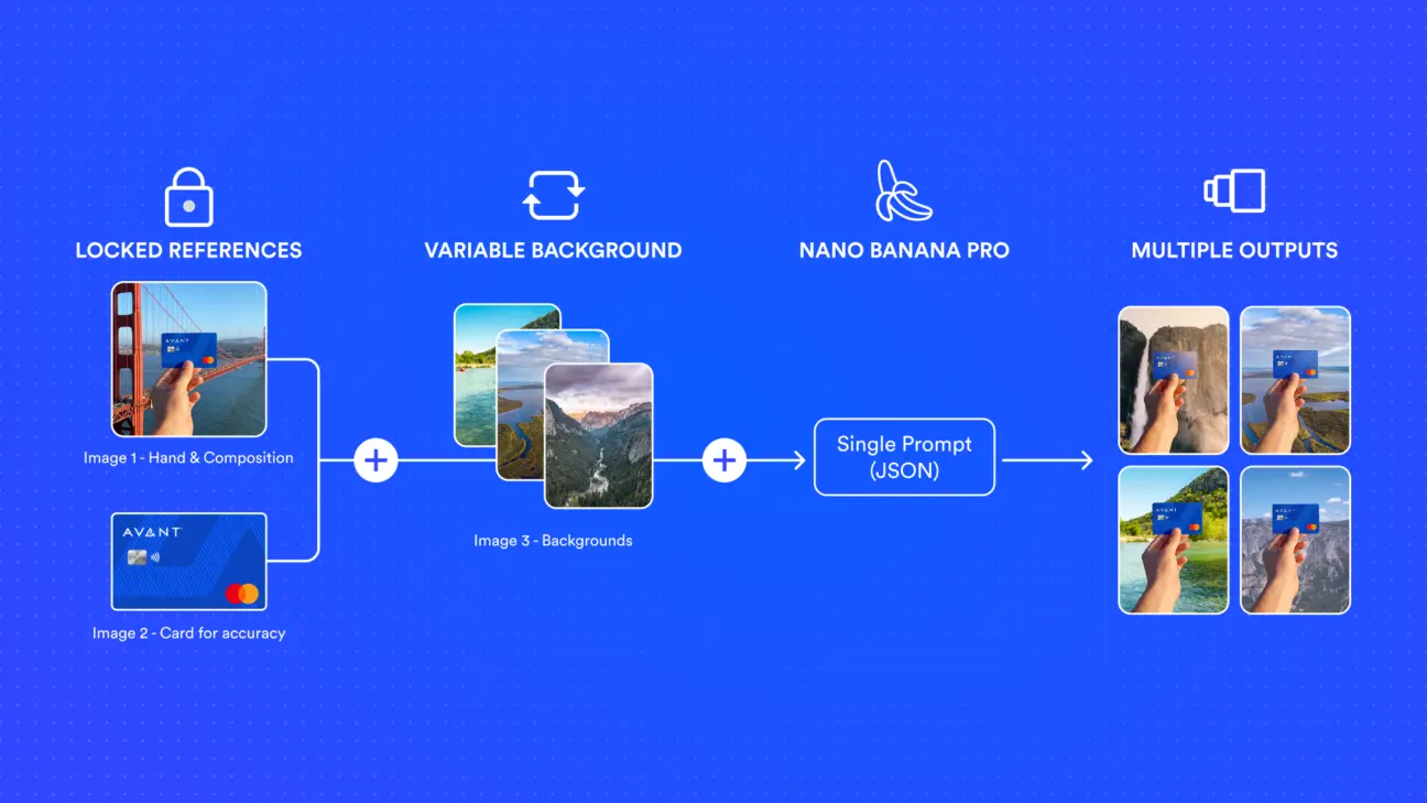
We started with one approved reference image of the card held in front of the Golden Gate Bridge. That locked the hand position, card scale and overall composition. A second reference locked the card itself, so the branding and product details stayed accurate.
Those two images stayed fixed inside the same structured prompt. The background was the variable.
That meant Yosemite, the Everglades or Garner State Park could be swapped in while the hand and card stayed consistent from frame to frame. Instead of rebuilding the image every time, we were changing one part of a controlled system.
The workflow gave us speed, but more importantly, consistency. One set of references. One prompt structure. Multiple accurate outputs.
From there, we art directed each landscape to suit the campaign. Wide mountain views gave the typography room to breathe. Waterfalls added movement. Wetlands introduced flatter horizons and more open colour. Small details, like a bird cutting through the headline, helped some frames feel more like captured moments than constructed ads.
The Result
The result was a flexible image system rather than a single hero asset.
The card, hand and composition stay recognisable. The destination can keep changing. That gives Avant a campaign language that can move across locations, seasons and messages without needing to start again each time.
It also showed where generative production becomes most useful. Not in creating endless random options, but in locking the parts that matter and making the right parts easy to change.
One visual system. A growing library of destinations. Plenty of room to keep going.