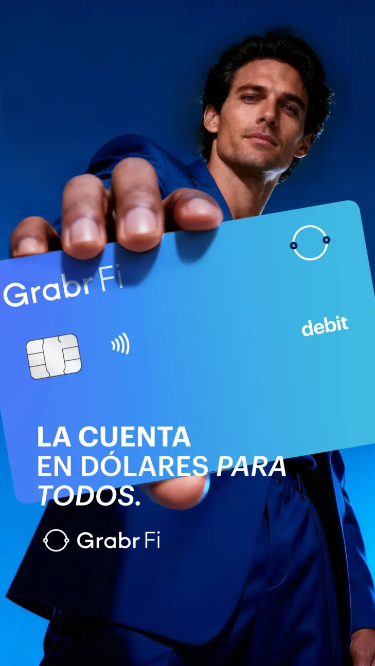
Strength in Simplicity
This concept centred the GrabrFi card as a statement piece for financial freedom. The creative showed it as more than a product, positioning it as a visual emblem of access to dollars with style, clarity, and purpose.
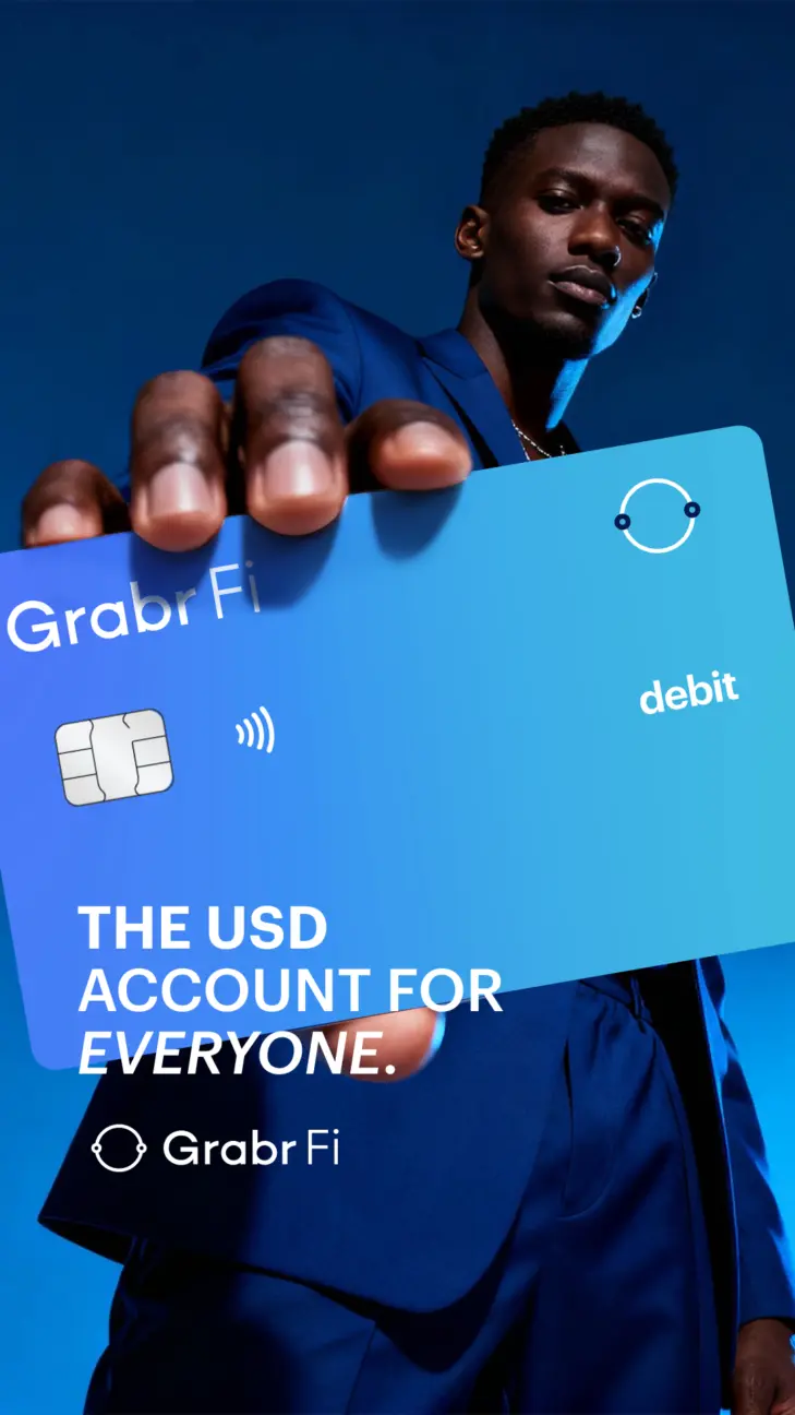
Blue as Identity
The colour palette defined every frame, creating an instant connection to trust and financial clarity. It became a signal of strength and direction, showing how the GrabrFi dollar account gives users stability in an unpredictable world. The simplicity of the tone reflected a brand that leads with assurance, not excess.
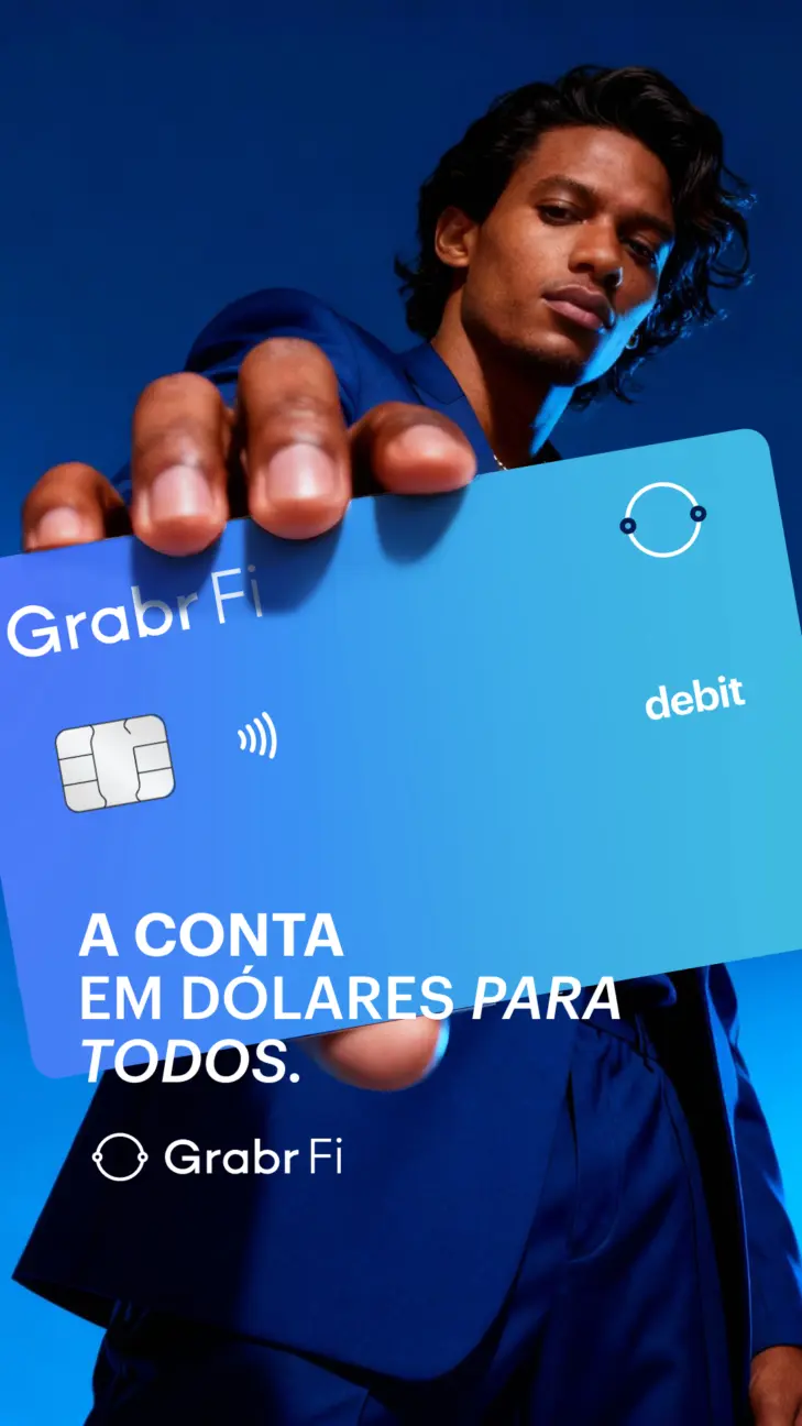
Confidence in Reach
Each portrait was composed with focus and purpose. The subjects hold the card forward, claiming control over their financial world. Lighting and posture were used to express ambition and access, capturing how holding dollars through GrabrFi means having a bridge to opportunity, wherever you are.