Credit That Gets You There
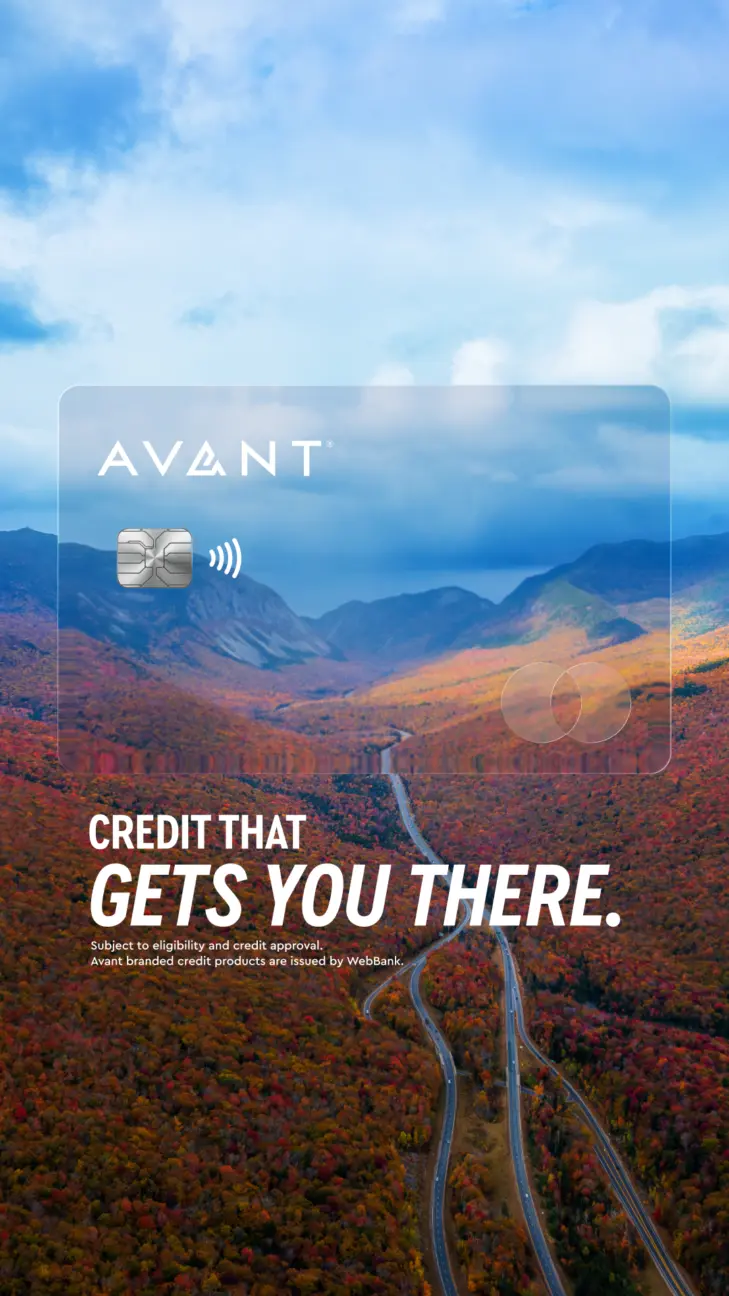
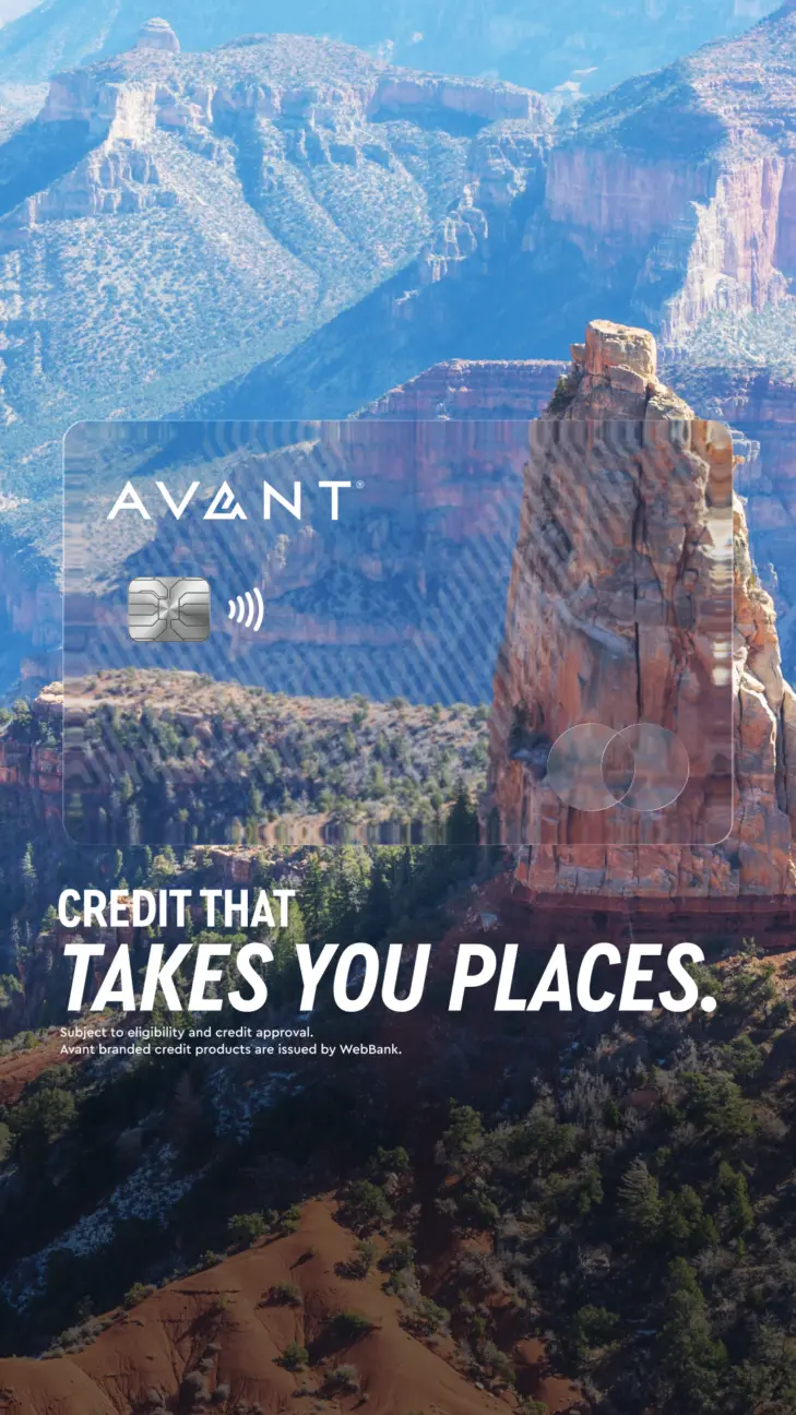
Card-led advertising usually puts the product front and centre. We did the opposite. We made the card transparent and put the destination behind it.The card becomes the lens. Look through it and the world opens up. The campaign line, “Credit that takes you places,” works on two levels. The destinations are literal. The promise is not. It’s about progress, opportunity and what comes next. One image carries both ideas at once.
The Concept
The card sitting inside a real location is a familiar device in financial advertising. It works because it immediately links the product to a destination. Rather than reinvent it, we wanted to push it somewhere more interesting.
Avant already has strong direct-response creative. That’s important. When someone is actively comparing credit products, the offer should do the talking. But not every ad needs to close the sale. Some need to create the desire to start the journey in the first place.
The difference was simple. Instead of placing an opaque card over the landscape, we made it transparent. The card became the lens rather than the object. You don’t just see the destination. You see it through the product. The composition tells the story before the headline does.
Just as importantly, the idea was built as a system. Swap the landscape and the creative still works. National parks become coastlines. Coastlines become city landmarks. The relationship between the card and the destination never changes, making it easy to scale the campaign while keeping a consistent visual language.
Our Process
The card had to feel like a real object, not a flat layer sitting on top of a photo. We added a faint diagonal refraction where it crosses the landscape, with the image behind shifting slightly out of register. It is subtle, but it is what makes the glass feel physical.
We built two card states. One keeps the full-colour Mastercard mark for placements that need it. The other softens the mark back into the glass, which keeps the composition cleaner when the red and orange start fighting with the landscape.
The concept also gave us room to test different levels of copy. “Credit that gets you there” and “Credit that takes you places” stay light and let the image do most of the work. “Build credit. Go places. Build with Avant.” gives a little more context for audiences who need the product explained more directly.
There is no rate in the set and no CTA button. That is deliberate. The job of these frames is not to close the sale. It is to make the idea feel desirable enough that someone wants to know more.