Three Countries, One Brand
We built Krypta as a test brand for a global crypto exchange looking at Northern European expansion. It started as a piece of market research and ended up as a brand-lite pack for internal review.
The Concept
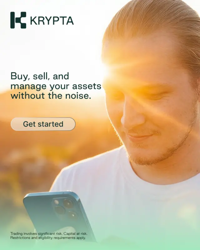
Crypto branding has settled into a house style of neon, dark backgrounds, abstract 3D and no people anywhere. It's a look the whole category shares, and it's stopped working.
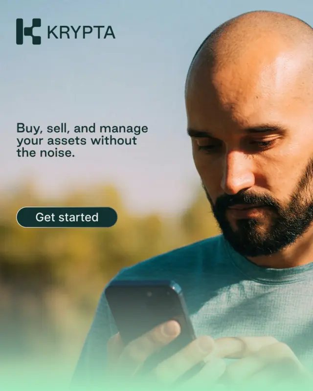
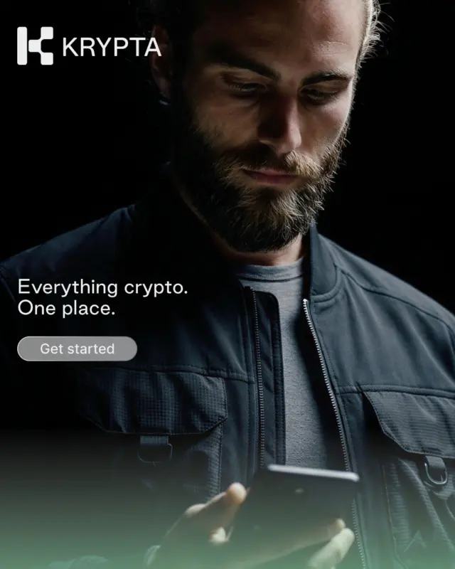
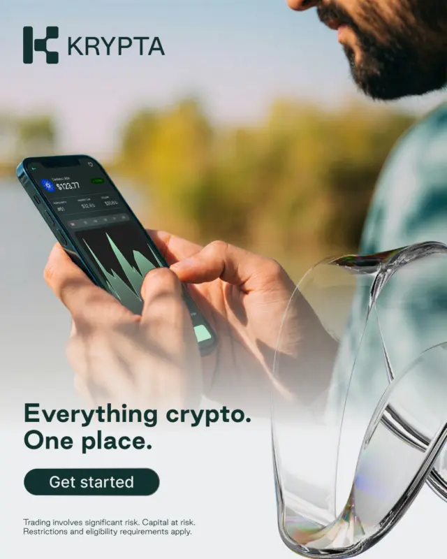
We built Krypta to feel like the opposite. It uses a Nordic palette, quieter typography and more whitespace, with photographs of real people in natural light where competitors would usually put coins and charts. The line we ended up with was "crypto without the noise."
The Research
Before we designed anything, we put together a market intelligence dossier for the client. We pulled App Store scores, competitor teardowns, review sentiment, Meta ad-library scans, tax context and cultural background across the Netherlands, Norway and Finland, treating each of the three markets as its own competitive landscape rather than lumping them together as "the Nordics." The point was to work out where the whitespace was in each market, and what a brand designed to fill it should look like.
What We Found
The country-level findings each pointed to a different positioning opportunity, and it's those insights the client will take into Phase 2 and beyond.
Netherlands
The market is mature and competitive. Bitvavo alone holds around 49% share and has more than 2 million users. But no Dutch crypto brand addresses the thing Dutch investors actually worry about, which is the Box 3 wealth tax and its 36% deemed-return rate that applies whether or not you've made money that year. Every brand competes on fees, features and asset counts, and none of them speak to that anxiety.
Norway
Firi owns the entry-level market with a "crypto for everyone" position that has worked well, but the success has left a gap. The people who came in through Firi two years ago now hold real assets and haven't got anywhere to graduate to. There's a cultural piece to this too. Jante Law makes any "better than Firi" positioning risky in Norway, so if we were going to say anything it had to be "what's next" rather than "we're better."
Finland
Coinmotion is the incumbent and a strong one: 150,000 users, 14 years in market, full Finnish localisation. But they run no paid social. When we scanned the Meta Ad Library for Finnish-language crypto ads, we got nothing back. So Finland isn't a first-mover opportunity, it's a channel-led one where a paid-social presence has no local competition to contend with.
What Shaped the Design
Beyond the country-level insights, a handful of cross-market findings shaped the design work directly.
Across all three markets every brand was competing on the same functional set of things, which is basically some combination of safe, easy, regulated, and locally payment-integrated. Nobody had done any real work on emotional identity or values. Both local leaders were experiencing sharp review-sentiment declines too: Bitvavo's recent reviews averaged 1.7 stars and Firi's averaged 2.6, versus lifetime averages above 4.6 for both. The category as a whole was tired, and it looked like there was space for a brand that felt like something other than a feature list.
The other finding that mattered a lot was that Norwegian crypto brands use zero human imagery. Firi uses flat cartoon illustrations, NBX uses dark premium mockups, and no local brand puts a real person on screen. That's a visual gap in a market where warmth and human presence aren't part of the category's vocabulary at all.
Designing Krypta
Once we had all of that in front of us, the direction was clear. Krypta had to bring emotional identity, human presence and a trust story that competitors couldn't match.
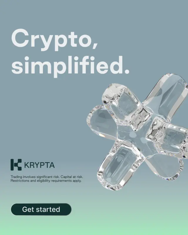
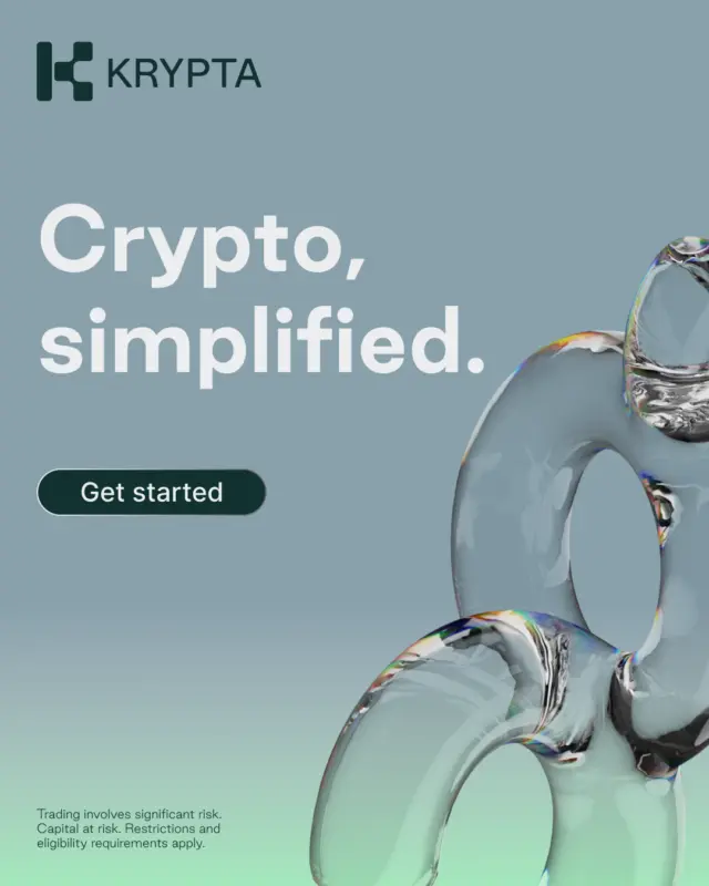
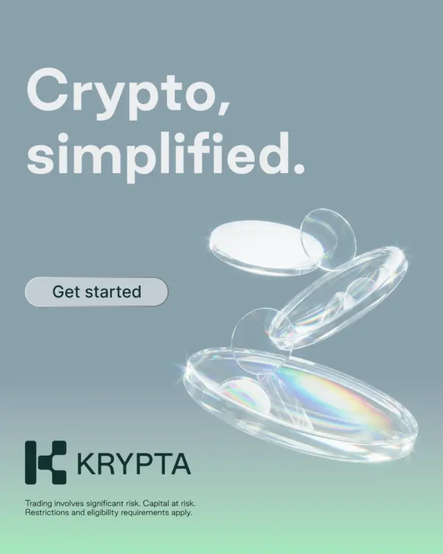
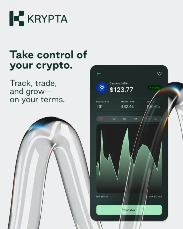
The identity is a K-block monogram that scales from favicon to billboard, on a palette of deep forest green and soft mint chosen to sit apart from Bitvavo's dark navy and Firi's flat illustration. Good Sans is the typeface, clean at small sizes and modern at large. It's also free, which mattered for a brand still in test.
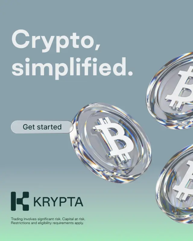
We packaged everything up as a brand-lite pack: logos, colours, type, sample ads and hero copy. Enough for the client's internal review, and enough to run into Phase 2 of the programme, which was a false-door creative test putting Krypta against a client-branded control in each of the three markets.